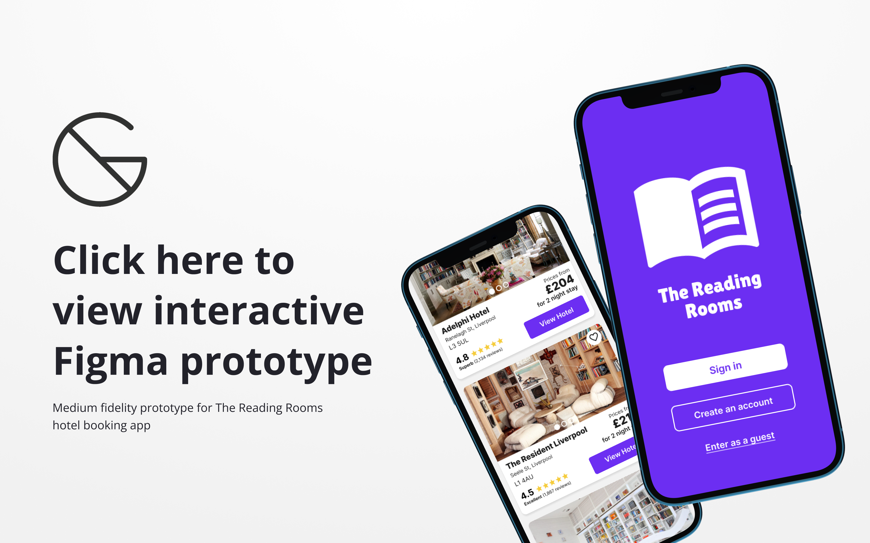
The Product
A mobile booking app for concept hotel chain ‘The Reading Rooms’.
A UK-based chain focused on providing stay-cations for book lovers.
Focusing on the entire ‘happy path’ of a typical user journey from app launch to hotel booking confirmation received.

Current Competitor Products
A number of competitors were researched to see how well similar existing products work.


Examples included: Hotels.com, Premier Inn, Booking.com, Secret Escapes, Barcelo Hotel Group & Marriott Bonvoy Hotels
Methods used:
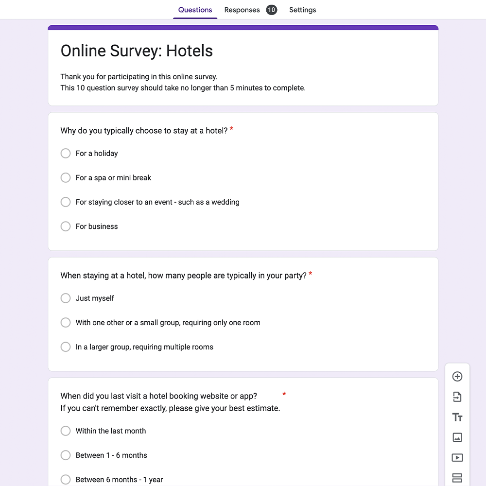
Competitor benchmarking, online surveys (via Google Forms) & various usability tests


User Testing & Research Findings
Tools such as affinity diagram sessions and customer journey maps helped pull out key research findings and find positive interactions & pain points to address in my own product. This also allowed key actions & behaviours, observations and noteworthy quotes to be documented for future reference.

Example affinity diagram session
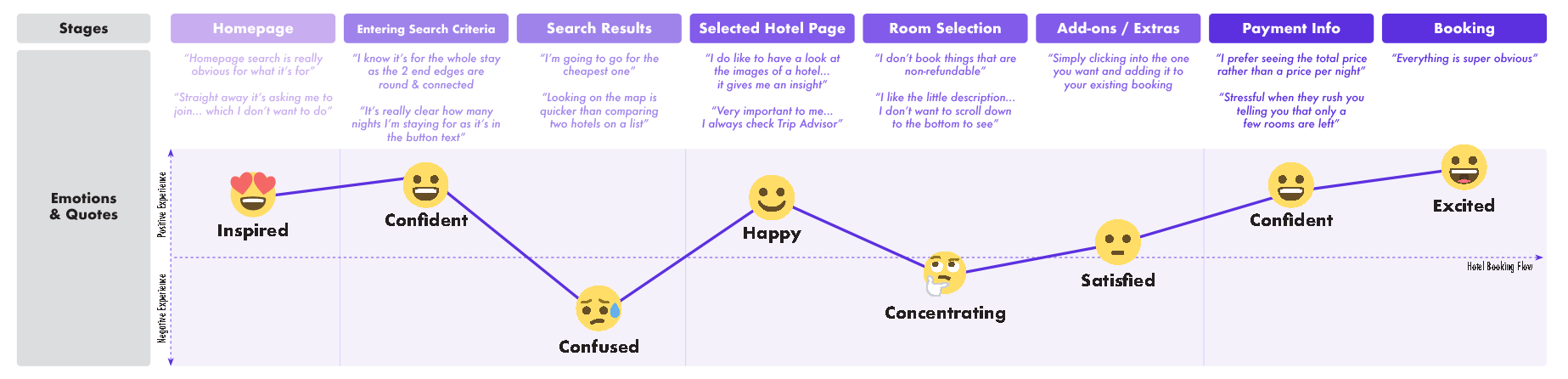
Customer joinery map noting the average user’s emotions and usability test quotations
😡 Compulsory account sign up/ sign in frustrate from the get-go
“It kept asking me to create an account when I was browsing, it kept making me lose my place”
Numerous usability tests showed test participants frustrated with having to sign up for an account before they could even access the main homepage of the hotel booking apps, while others frequently prompted with pop-ups. Participants wanted to get straight to seeing what hotels were on offer and didn’t necessary want to commit to an account prior. Some even seemed to distrust the app and became more guarded with what information they wanted to disclose later on in the booking journey.
😵💫 Don’t overwhelm early on
“I don’t know where to start… there’s almost too much to choose from”
Competitors which showcased a wide range of hotel options on their homepage, without first taking the test participants requirements into account, only seem to distract and overwhelm. Even sub-grouping these hotels in categories such as ‘beach’ or ‘city break’ didn’t take important criteria into consideration such as location and dates available. With no information provided from the users, many of the results were not applicable and just added more distractions.
📸 Photography is a great tool to aid decision making and recall
“I do like to have a look at the hotel photos… it gives me an insight”
The application of relevant photography greatly helped and influenced users to make their decision when deciding on a hotel. In cases where test participants returned to the search results page, hotel imagery also greatly helped recall and made it easier to revisit shortlisted venues.
🗓 Check in & check out dates often tricky to select
“doesn’t need to be two separate calendars… I didn’t notice that straight away”
Both usability testing and competitor benchmarking frequently highlighted overly complex date selections which caused a lot of frustration and confusion – with dates often become de-selected and difficulty moving between calendar months/ years. Being an essential part of the booking process, the importance of selecting the right dates, the user needs to feel confident they can correctly complete this stage with as little friction as possible.
💸 Be upfront & honest about pricing
“the different rooms rates for this hotel vary loads”
Feedback from both usability tests and online surveys found that price was one of the most important factors when deciding on a hotel, but often was difficult to find out early on in the booking journey; with price per night & ‘from’ prices the norm on search results pages.
Being such an important factor, if the chosen hotel was found out to be too expensive later on in the booking process, users would deem it important enough to go back and re-look at over options; wasting time and becoming frustrated.
Design Goals
Given the user research outlined, the goals for my concept product are as follows:
👋 Be more interested in the individual
Instead of showing lots of generic ‘top choice’ hotel results on the homepage (which often pay to be showcased) encourage the user to get straight into filling out their hotel stay requirements; so they can quickly get to browsing hotels relevant to them.
🤝 Be upfront & honest
Display key decision-making criteria such as star ratings & pricing as early on in the booking process as possible. Listing all fees & taxes if applicable so the user has no negative experiences later on when proceeding to payment.
🤸♂️ Provide more flexibility
The preferred way of selecting a hotel from the search results varied for user to user. The two most popular being by location via a map view or in price order as a list. It is essential users can order their results in both these ways to ensure the majority of use cases are catered for. Users should also not be penalised for wanting to go back and forth between stages and not lose their search results or have to start all over again by having to re-fill in their stay criteria.
😎 Give the user confidence
Ensure the structure and flow of the booking app, as well as the design patterns used, match the existing mental models of the typical user. Also, ensure more high importance/ complex parts of the journey (ie. payment information) are broken up into stages as to not overwhelm and cause errors – overall increasing the user’s speed and confidence.
Information Architecture, User Flow & Sketches
With competitor research findings & my design goals set, I began to refine the user flow of the ‘happy path’ of my hotel booking app, considering all key screens that the user would need to navigate from the homepage right through to the booking confirmation.

Happy path flow diagram of hotel booking app
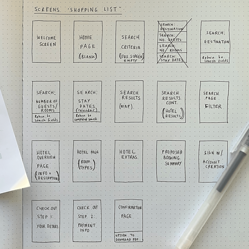
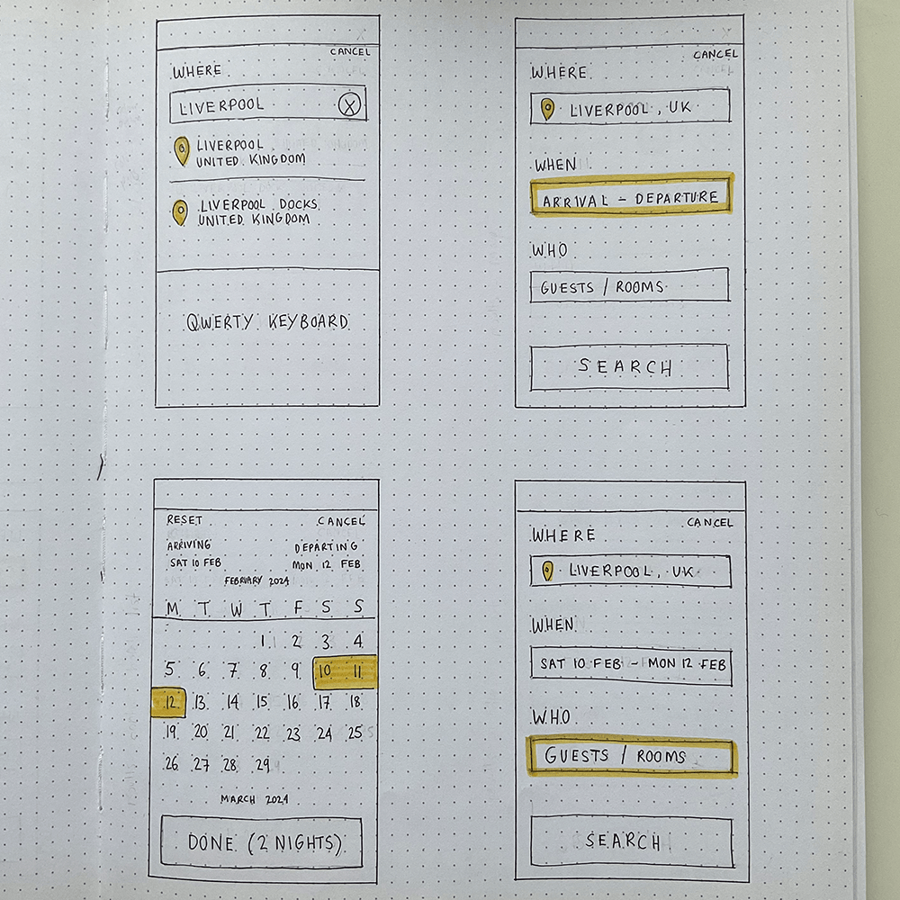

Screen shopping list & a selection of wireframe sketches
Prototype
I then translated my screen sketches into a medium fidelity interactive prototype in Figma, showcasing key interactions and all finalised copy. This can then serve as a great tool for further usability tests as well as starting the iterative design cycle for future higher fidelity prototypes.
Features at a glance

Search box is at the top of the home screen flooded in full colour & has the first field highlighted in a contrast colour to encourage interaction. Most popular hotels takes up a small section at the bottom of the page.
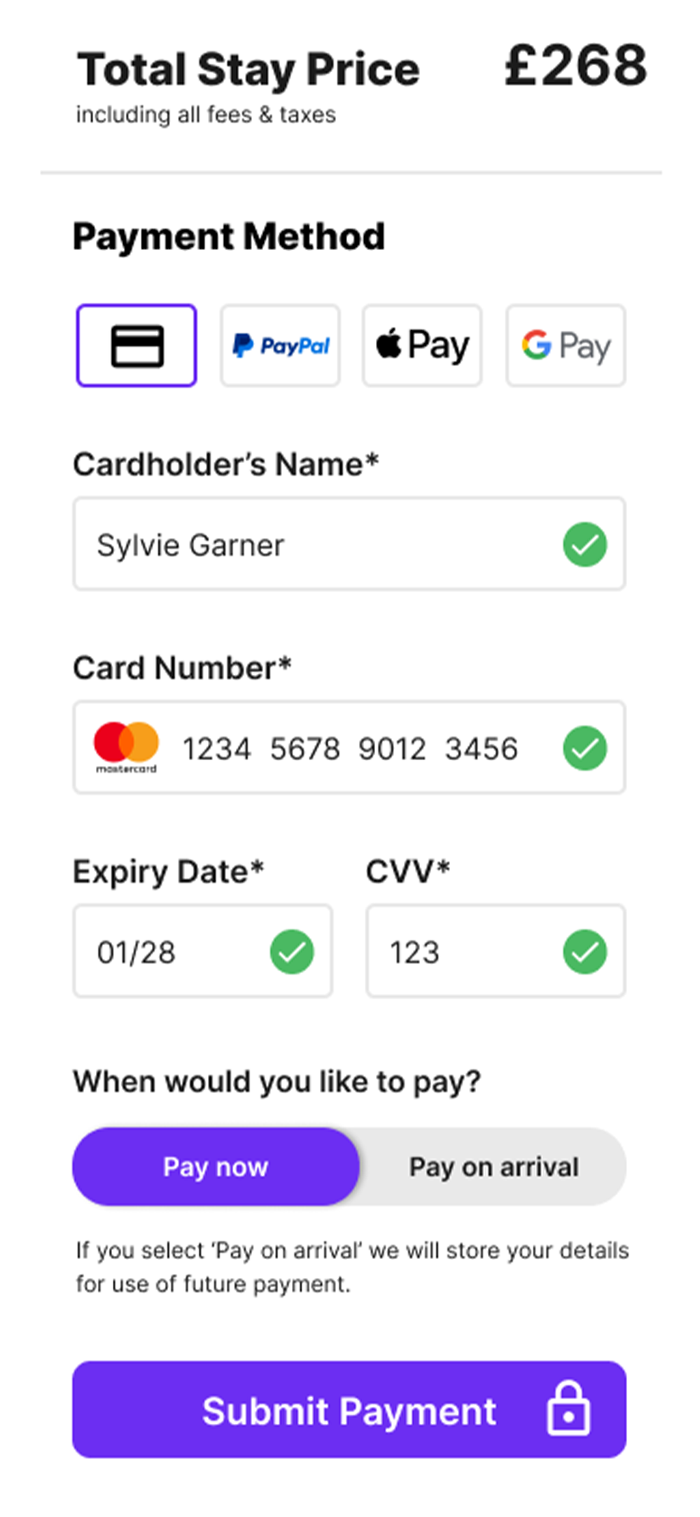
Padlock and official payment iconography reinforces legitimacy of app. Green validation check marks feedback to user that correct information has been provided and full colour CTA means user can proceed.
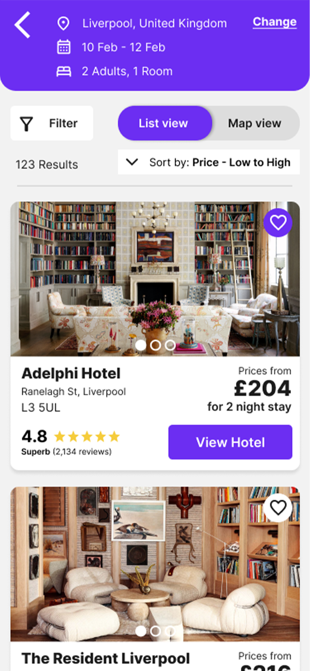
Search criteria at top of results page with the option to amend if needed. All key hotel information is displayed ie. reviews, address & cheapest price for entirety of stay. Option to toggle between list & map view.
Prototype Feedback & Conclusions
Following completion of my interactive prototype, I sent it across to 2 test participants to get their initial feedback and overall thoughts. For future developments, I would look to increase the fidelity of the prototype and look to get more feedback from a wider group of test participants prior to building.
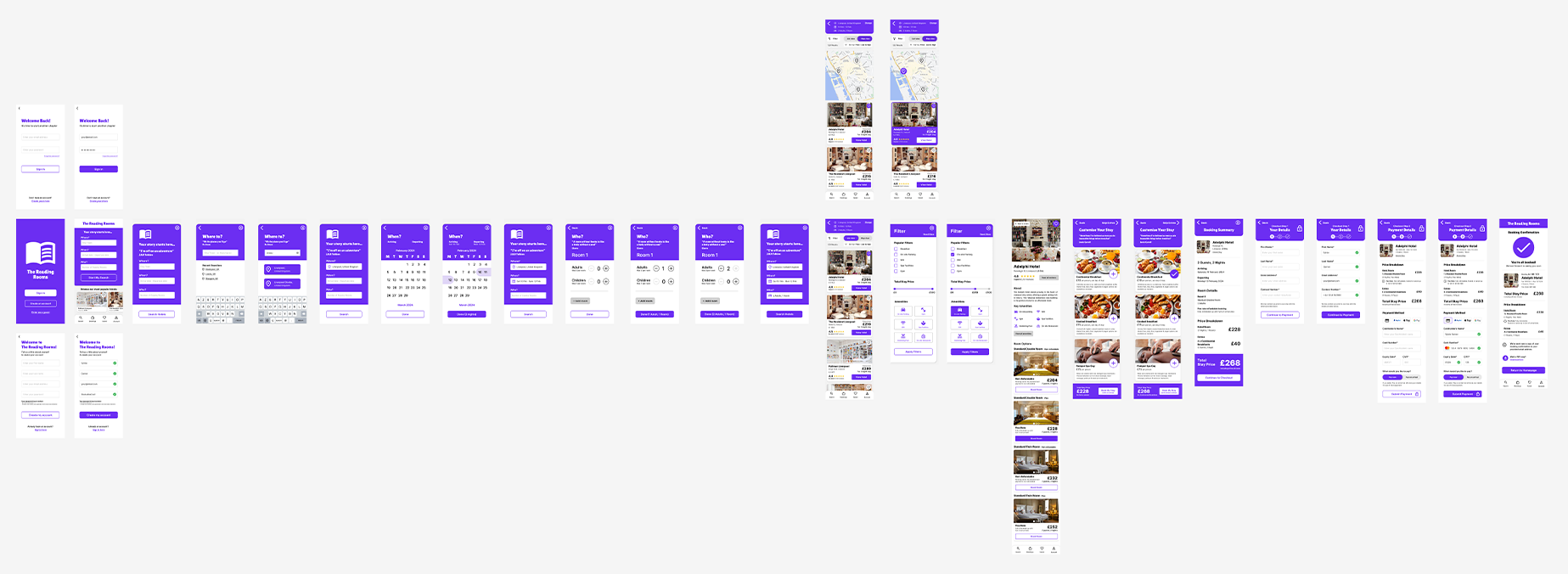
Figma Screens Overview
📸
“I love all the photos – they show the vibe of each hotel really well”
💳
“The payment section was straightforward and easy to move through”
⛵️
“Filling in my hotel stay info step by step made it feel less overwhelming”
😶
“I liked that I could book a holiday as a guest customer”
💵
“I feel like I knew exactly how much I would be paying”
🔍
“No fuss and easy to look through hotels”
This project was completed as part of my Professional Diploma in UX Design via the UX Design Institute and Glasgow Caledonian University. All rights reserved.
